Contents
Interpreting the central means charts
Central means graphs are automatically provided by the free Excel cluster analysis template These charts show the center of each of the five segments based upon the first two variables that you have input.
The central means chart is effective in helping to understand the general concept of cluster analysis and I would almost recommend this as a starting point if you need to have a quick understanding of this analytical tool.
Reading the central means charts
 As you can see in the following, there is a series of symbols marked on the central means chart. Each of the smaller symbols represents an individual consumer – in this example there are 100 consumers marked based upon their loyalty and the level of advertising awareness.
The cluster analysis statistical process goes through the set of consumers and their data and tries to classify them into clusters, or what we know in marketing as segments, based upon similarities.
As you can see from the diagram, in the top left-hand corner, the red squares, they represent individual consumers that the cluster analysis template has classified as segment two. In the center area of those red squares, you will see a larger black circle – which is the statistical mean/average (centroid) of all the consumers that have been classified to that particular segment.
Likewise, in the top right-hand corner you will see blue diamonds (representing individual consumers that have been classified as being in segment one) and a larger red circle towards the center of the blue diamond that represents the statistical average of consumers categorized as being in segment one.
What the central means graph tells us
The plotting of the individual consumers and the center (mean/average) of each segment is very helpful for understanding the broad concept of cluster analysis and how it relates to market segmentation. The cluster analysis template simply starts with data from 100 consumers, with no idea of what segments they belong to.
Through a series of statistical trial and error steps (iterations), the cluster analysis calculation will allocate each of these consumers into similar categories (that we call market segments in marketing).
Therefore, this type of chart allows the concept of cluster analysis to be quickly and easily communicated – and may be a good educational tool to help explain the concept of clustering to your peers or other interested people.
Why use cluster analysis – when we could just look at a graph?
Obviously, if you only had two variables (as in the graph above), you can actually use a scatter plot or a central means chart to identify broad segments.
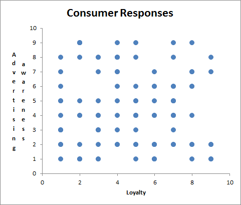
If you have mapped the individual responses of these 100 consumers onto a scatter chart, you would produce a chart that looks like this one.
And you may be able to arbitrary divide the overall market into an array of market segments.
This is clearly a possibility we you only had two variables to consider.
However the Excel clustering template available on this site enables you to consider up to eight variables at one time – and it obviously not possible to undertake using a visual interpretation approach, as you cannot graph such an array of data. Therefore, you need a more sophisticated statistical approach, such as clustering analysis, when you are considering more than two marketing variables.