This is a step by step guide on how to run k-means cluster analysis on an Excel spreadsheet from start to finish. Please note that there is an Excel template that automatically runs cluster analysis available for free download on this website. But if you want to know how to run a k-means clustering on Excel yourself, then this article is for you.
In addition to this article, I also have a video walk-through of how to run cluster analysis in Excel.
Contents
- 1 Step One – Start with your data set
- 2 Step Two – If just two variables, use a scatter graph on Excel
- 3 Step Three – Calculate the distance from each data point to the center of a cluster
- 4 Step Four – Calculate the mean (average) of each cluster set
- 5 Step Five – Repeat Step 3 – the Distance from the revised mean
- 6 Final Step – Graph and Summarize the Clusters
Step One – Start with your data set
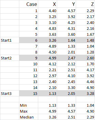
For this example I am using 15 cases (or respondents), where we have the data for three variables – generically labeled X, Y and Z.
You should notice that the data is scaled 1-5 in this example. Your data can be in any form except for a nominal data scale (please see article of what data to use).
NOTE: I prefer to use scaled data – but it is not mandatory. The reason for this is to “contain” any outliers. Say, for example, I am using income data (a demographic measure) – most of the data might be around $40,000 to $100,000, but I have one person with an income of $5m. It’s just easier for me to classify that person in the “over $250,000” income bracket and scale income 1-9 – but that’s up to you depending upon the data you are working with.
You can see from this example set that three start positions have been highlighted – we will discuss those in Step Three below.
Step Two – If just two variables, use a scatter graph on Excel
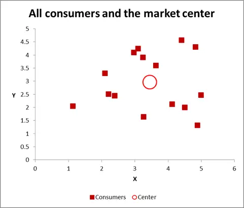
In this cluster analysis example we are using three variables – but if you have just two variables to cluster, then a scatter chart is an excellent way to start. And, at times, you can cluster the data via visual means.
As you can see in this scatter graph, each individual case (what I’m calling a consumer for this example) has been mapped, along with the average (mean) for all cases (the red circle).
Depending upon how you view the data/graph – there appears to be a number of clusters. In this case, you could identify three or four relatively distinct clusters – as shown in this next chart.
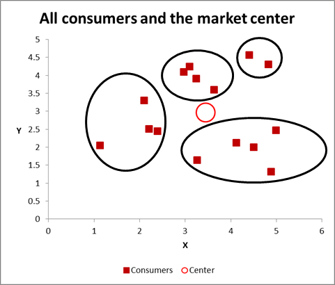
With this next graph, I have visibly identified probable cluster and circled them. As I have suggested, a good approach when there are only two variables to consider – but is this case we have three variables (and you could have more), so this visual approach will only work for basic data sets – so now let’s look at how to do the Excel calculation for k-means clustering.
Step Three – Calculate the distance from each data point to the center of a cluster
For this walk-through example, let’s assume that we want to identify three segments/clusters only. Yes, there are four clusters evident in the diagram above, but that only looks at two of the variables. Please note that you can use this Excel approach to identify as many clusters as you like – just follow the same concept as explained below.
For k-means clustering you typically pick some random cases (starting points or seeds) to get the analysis started.
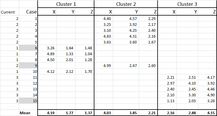
In this example – as I’m wanting to create three clusters, then I will need three starting points. For these start points I have selected cases 6, 9 and 15 – but any random points could also be suitable.
The reason I selected these cases is because – when looking at variable X only – case 6 was the median, case 9 was the maximum and case 15 was the minimum. This suggests that these three cases are somewhat different to each other, so good starting points as they are spread out.
Please refer to the article on why cluster analysis sometimes generates different results.
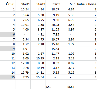
Referring to the table output – this is our first calculation in Excel and it generates our “initial choice” of clusters. Start 1 is the data for case 6, start 2 is case 9 and start 3 is case 15. You should note that the intersection of each of these gives a 0 (-) in the table.
How does the calculation work?
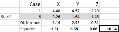
Let’s look at the first number in the table – case 1, start 1 = 10.54.
Remember that we have arbitrarily designated Case 6 to be our random start point for Cluster 1. We want to calculate the distance and we use the sum of squares method – as shown here. We calculate the difference between each of the three data points in the set, and then square the differences, and then sum them.
We can do it “mechanically” as shown here – but Excel has a built-in formula to use: SUMXMY2 – this is far more efficient to use.
Referring back to Figure 4, we then find the minimum distance for each case from each of the three start points – this tells us which cluster (1, 2 or 3) that the case is closest to – which is shown in the ‘initial choice column’.
Step Four – Calculate the mean (average) of each cluster set
We have now allocated each case to its initial cluster – and we can lay that out using an IF statement in a table (as shown in Figure 6).
At the bottom of the table, we have the mean (average) of each of these cases. N0w – instead of relying on just one “representative” data point – we have a set of cases representing each.
Step Five – Repeat Step 3 – the Distance from the revised mean
The cluster analysis process now becomes a matter of repeating Steps 4 and 5 (iterations) until the clusters stabilize.
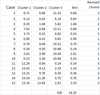
Each time we use the revised mean for each cluster. Therefore, Figure 7 shows our second iteration – but this time we are using the means generated at the bottom of Figure 6 (instead of the start points from Figure 1).
You can now see that there has been a slight change in cluster application, with case 9 – one of our starting points – being reallocated.
You can also see sum of squared error (SSE) calculated at the bottom – which is the sum of each of the minimum distances. Our goal is to now repeat Steps 4 and 5 until the SSE only shows minimal improvement and/or the cluster allocation changes are minor on each iteration.
Final Step – Graph and Summarize the Clusters
After running multiple iterations, we now have the output to graph and summarize the data.
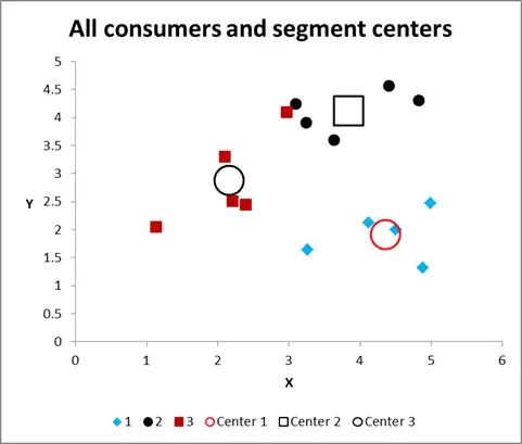
Here is the output graph for this cluster analysis Excel example.
As you can see, there are three distinct clusters shown, along with the centroids (average) of each cluster – the larger symbols.
We can also present this data in a table form if required, as we have worked it out in Excel.
Please have a look at the case in Cluster 3 – the small red square right next to the black dot in the top middle of the graph. That case sits there because of the influence of the third variable, which is not shown on this two variable chart.
For more information
- Please contact me via email
- Or download and use the free Excel template and play around with some data
- And note that there is lots of information on cluster analysis on this website
Related Information
How to allocate new customers to existing segments