Contents
- 1 A step-by-step guide to understanding the cluster analysis process
- 1.0.1 Step one – the data is collated, but unsorted
- 1.0.2 Step two – sort the consumers into segments/clusters
- 1.0.3 Step three – use cluster analysis to construct measures of the data
- 1.0.4 Step four – review the measures and logic of cluster analysis
- 1.0.5 Step five – integrate more variables into the cluster analysis
A step-by-step guide to understanding the cluster analysis process
Cluster analysis is a statistical technique that is designed to assist marketers transform consumer data into usable and valuable market segments, in order to select attractive target markets.
In this article, we will work through the process of working through what you need to do to run cluster analysis for marketing purposes – it should will give you a good understanding of how cluster analysis works and how it is valuable in forming market segments.
You will also see – in step two below – a basic visual technique for forming broad market segments from a scatter-plot chart, which can be used in the initial stages of market segmentation (note: visual techniques work better with two marketing variables only).
Step one – the data is collated, but unsorted
For this example, let’s assume that your firm has captured information from consumers using some form of market research survey. In the questionnaire they have asked the consumers about their brand loyalty and about their level of advertising awareness. Both of these questions were asked using a 1 – 9 ranking scale.
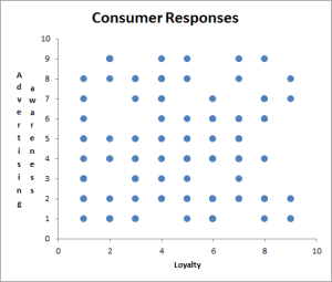
When the data was being analyzed, the marketing analyst wanted to examine the relationship between advertising awareness and brand loyalty. Therefore, the following scatter chart (Figure 1) was constructed from these two variables.
This scatter chart shows the responses of 100 consumers (or respondents). As you can see, the responses are scattered across the chart without any apparent pattern. As a next step, the marketing analyst considers whether these two important marketing variables could be utilized to form interesting market segments.
Step two – sort the consumers into segments/clusters
As there are only two variables being considered in this example – namely brand loyalty and advertising awareness – it is possible to visually represent the data on a scatter or bubble chart and manually attempt to identify segments. This could be done as shown in the following diagram (Figure 2)
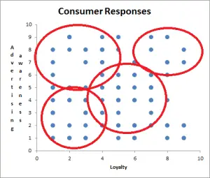
As you can see, there are four circles being drawn on the same consumer data as above. By using this “manual method”, we are able to classify most consumers to a segment – with a few outliers. This is done on both a visual and a logical basis. Visually, we look to group similar responses together. And logically, we look to group consumers that tend to make “marketing sense” together – given the data that we have.
If we look at our four “market segments” that we have identified using the visual method – then the top right-hand corner has highly loyal consumers that also have a high level of advertising awareness. The opposite segment is in the bottom left-hand corner, where there is low loyalty and low advertising awareness. In this case, these two variables are strongly correlated (that is, they appear to have some form of relationship).
However the other two segments are quite interesting. In the bottom right-hand corner and towards the center of the graph, we have a relatively highly loyal group consumers, yet their level of advertising awareness is not that high. This suggests that this particular market segment does not engage in advertising communication or that they are loyal through their experience or some other driving factor.
The visual segment identified in the top left-hand corner is also of significant interest – with low levels of loyalty, yet very aware of advertising. This suggests that either the advertising lacks influence with this segment, or the segment uses advertising information to drive their switching behavior towards the best purchase decision.
As you can see, the more “unusual” market segments identified, then the greater chance of a marketing insight being discovered – ideally leading to a more effective market segmentation and a successful marketing strategy.
Step three – use cluster analysis to construct measures of the data
As suggested by our visual interpretation of the data, there could be a number of interesting market segments identified by the use of the two marketing variables – brand loyalty and advertising awareness. However, using a visual technique, we can broadly defined the segments, but we have no statistical information about each of the segments.
This is where cluster analysis can be utilized. This website provides a free download of a cluster analysis Excel template that is very easy to use and requires no statistical or particular spreadsheet skills.
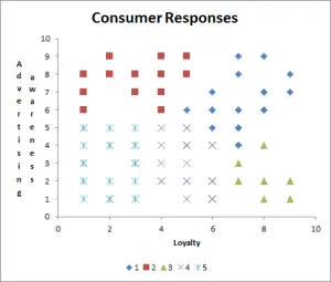
Cluster analysis will use this data and then classify each consumer and their data/responses into a particular segment. This is shown in the following diagram (Figure 3).
This is exactly the same consumer data as above, but it has been run through the free cluster analysis Excel template and has classified each consumer point into one of five segments.
As you can see, the approach is quite similar to our visual technique of clustering, but now we have assigned each consumer to a particular segment – which allows us to measure the size of each segment, as well as determine their average needs (or utilize any other information that we may hold on our consumer database or have obtained from a market research survey.)
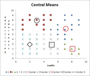
The cluster analysis template also provides the average – also known as the mean – of each consumer segment, as shown in in the next output titled Central Means (Figure 4). The heading of the chart simply explains that the larger circles/symbols in the middle of each set of consumer data points (for each market segment) are the average/mean for that segment – in other words, the center (or centroid) of the segment.
Step four – review the measures and logic of cluster analysis
The chart showing the central means of each the five segments is also supported by other data in the Excel template for cluster analysis.
One of the key outcomes is a segmentation map, which shows the size of each market segment relative to the total market (refer Figure 5).
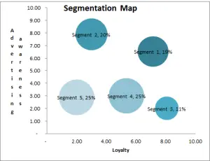
From this chart you can identify that the five segments range in size from 11% of the market – segment three – to the two largest segments both representing 25% of the market. These measures of market segments are invaluable in assessing the market potential and financial viability of potential target markets.
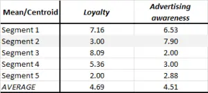
Another valuable output from the cluster analysis Excel template, are the measures for each of the segments, as shown in the following table (Figure 6). This information, we are able to construct our “typical”consumer (or segment profile) for each of the segments – again another valuable piece of measurement.
Step five – integrate more variables into the cluster analysis
So far we have only used two marketing variables to help define our market segments. However, the Excel template is able to handle more marketing variables – up to eight in the free version available for download.
Therefore, a richer view of each market segment can be formed by incorporating more marketing data. This will lead to greater understanding and insight to the needs and preferences of each segment. At this stage, while we have classified the segments, other than these two initial variables we know relatively little about the consumers in them.
Further reading
Please browse through this cluster analysis for marketing website and you’ll find more information about the process and how to review data using multiple marketing variables – please use either the search box or the top menu. And I would encourage you to play around with the Excel template and experiment with different marketing variables to try and form interesting market segments.